
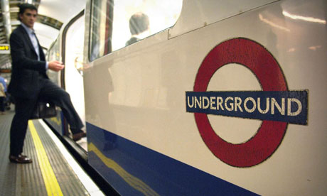
 This week marks the centenary of the London Underground logo. The familiar red and blue roundel was designed simply to make station names more visible, but over time it has become a symbol of the city. Amazingly, the original designer started off by basing it on the logo of the YMCA (Young Men's Christian Association). The original version of the logo, a solid red disk with a blue bar, also bears more than a passing resemblance to the Martini logo. There are also London Underground logos in other places , such as Wittebergplatz in Berlin. The Guardian newspaper has a photo gallery about the London Underground logo.
Thursday, 9 October 2008
The power of logos
Publié par Jane à l'adresse 23:38
Subscribe to:
Post Comments (Atom)


1 Comment:
thanks for these Dr B
Post a Comment